Sometime between the appearance of the equipment catalog of December, 1916 and the issue of May, 1918, the B.S.A. replaced the set of thirty postcards depicting Scouting activities. The catalog number remained #3029, and the price remained a penny each or a set of thirty for twenty-five cents.
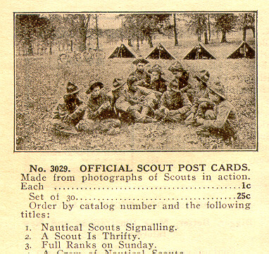
The new unnumbered cards illustrated a wider variety of activities including "Nautical Scouts." It featured the newly standardized uniforms, and, in addition to campcraft, emphasized a Scout's obligation to God and Country. The numbers in the listing correspond to the numbers in the catalog. The pictures used for four of the cards (#4, #10, #11 and #19) were among those used to illustrate the Sixth Annual Report of the Boy Scouts of America published as the April 1, 1916 issue of Scouting.
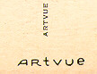
The firm chosen to produce the postcards was the Artvue Company of New York City. Before 1915, most high quality view postcards had been manufactured in Germany. With the beginning of World War I several printers in the United States recognized the need and entered the postcard market. Artvue was one of them, and for the next forty years the company continued to print postcards on a contractual basis for hotels, resorts, and summer camps.
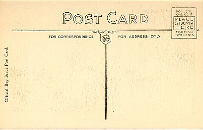
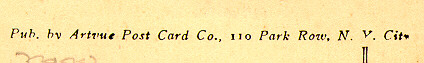
The postcard "back" used for the activity cards was a modification of Artvue's earliest known back style. The words "Official Boy Scout Post Card" appear to the left of the card where the company name and address would ordinarily have been. When the postcard is unused the distinctive style of the stamp box also indicates that the printer was Artvue.
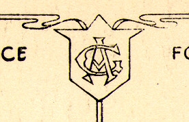
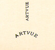
Type I - The first printing of the cards contained Artvue's monogram "AVC" inside the shield just above the spine on the back of the card. Several articles refer to the monogram as "AC". however, the company originally stylized it's name as "ArtVue Company," with a capital "V". Knowing that, careful examination of the monogram reveals it's true nature.
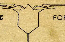
Type II - In subsequent printings the monogram was removed from the shield. In all other respects the cards are identical. Whether the Boy Scouts of America asked them to remove it as an identifying mark, or whether they removed it for some other reason is currently unknown.
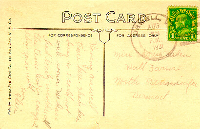
A few examples of camp cards exist that use this early back style but with the publisher's name indicated.
Detail of left edge
See for example Camp Sunrise in Vermont.
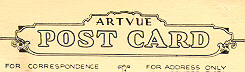
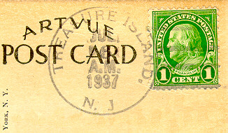
Over the years, Artvue changed it's back style several times. In the mid to late 1920s camp postcards can be found with "Artvue" over the words "Post Card". The card fronts looked very much like the Second Activity Series. (see some of the Treasure Island cards for example.)
In the 1930s they made the company name more prominent and began printing the fronts of the cards without a border, called "full bleed".
Later they moved the name to middle of the bottom of the card, just below the spine: first in a straight line and later in a curve. A few examples are known where the company name appears only on the spine.
Occasionally the same camp postcard may be found with or without a border and with several back styles as a popular photograph was used over and over.